
Color Theory- Saturation
Saturated vs Desaturated
This is from the book, Artful Machine Embroidery, by me, Bobbi Bullard. Though the book has a lot of information about embroidery, it includes a substantial section on Art and Design.
Saturation
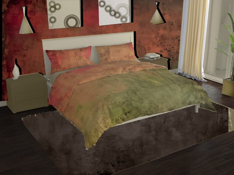
Saturation is the relative brightness or dullness of a color. In the red section of the color wheel, the clear, bright red is the most saturated. A salmon pink would be the light, muddied, less saturated version. A dark, brownish burgundy is a darker version of the less saturated color.
It’s All Muddy to Me
Until recently I had undervalued the importance of saturation as a color property. In retrospect, I realize I had misunderstood the whole concept. I had been misled by definitions like “the purity of the color,” and other vague descriptions.
At the same time as I was blithely dismissing saturation, I was lecturing about the possibilities of using “muddied,” or toned-down colors, thinking I had defined some elusive color concept. Although I hadn’t found references to muddied colors in color theory books, I explained how sage, salmon, denim blue and other muddied, (or subtle) colors make a statement in clothes. I noted that to produce a muddied color, you added some of the color’s complementary color. Add a little orange to blue to create denim blue. Add red to a pale green and —Voila!—sage green.
Only when I found a definition of saturation and desaturation I could understand did I realize that desaturation explains my “muddied” colors. Suddenly, the concept of muddied colors and their place on the color wheel, became clear. I resigned myself to the fact that I was not some great innovator in color theory.
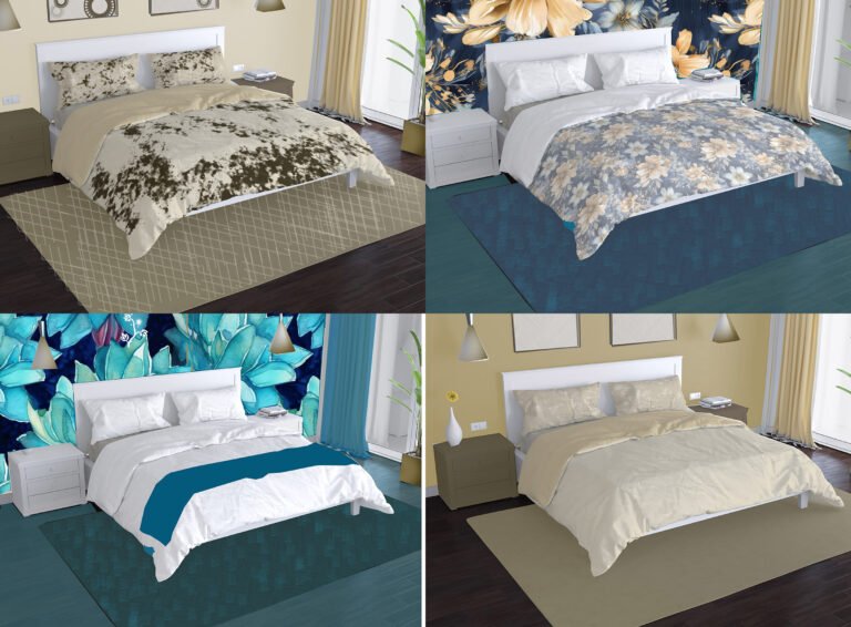
So much of color theory depends on taste and mood. One designer embraces only vibrant (saturated) colors, appreciating their powerful personalities. She considers the less saturated colors dull and vague.
The next designer appreciates the subtlety of the less saturated colors, complementing their delicacy, creating tranquil effects.
In addition to using a palette of only vibrant colors or only subtle colors, you can mix the two. When combining saturated and desaturated colors, be aware that saturated colors have a much more dominant presence than desaturated ones. Bright red feels more important than denim blue. Using a high ratio of denim blue to red will give the two colors equal amounts of attention and create aesthetic balance.
Very Subtle
I was introduced to desaturated colors in the early 1990’s when i had my colors “done” by a color specialist who worked with a palette beyond the usual “seasons” approach to color style. First, she found swatches that matched my hair and eye color. Then she sorted through an enormous number of swatches, pulling out colors that enhanced and flattered my eye and skin colors. She then assembled her masterpiece, colors that would highlight my attributes, an array that included coral, sage green, tans and browns. I was crestfallen.
“All of those colors are so dull,” I said (insert suitably whiny voice here).
She answered, “They’re not dull, they’re subtle.”
The moral of the story is that she was right. Those colors did look good one me. Now I seek out the dull—excuse me—subtle colors when sewing for myself. The desaturated colors have become very important to me.

Leave a Reply